Warning
Editing: Editing an existing field will edit it for all forms it is contained in.
Supported fields
Boolean
Allows the user to select a single option from a checkbox or two radio buttons. Stores a single value, for example, “yes” or “no” or "1" or "0." The value store is set when the field is configured. If no values are set 1 and 0 will be used.
Date
Allows the user to select a date from a pop-up calendar or select list, or enter a date in a text field.
Date (ISO format)
Allows the user to select a date from a pop-up calendar or select list, or enter a date in a text field. Stored in ISO format.
Date (unixtime)
Allows the user to select a date from a pop-up calendar or select list, or enter a date in a text field. Stored in unixtime format. Cannot be used for partial dates, it must be filled with a complete date -- year, month, day, hour, minute, second
Decimal
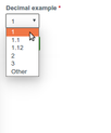
Allows the user to enter or select a decimal.
File
Allows a user to upload a file. Use the “File” widget and do not enable “Enable Display field” option.
Float
Allows the user to enter or select a number, stored as the float datatype. Float field is the same as Field Type Definitions#decimal, except that you cannot set a fixed number of integer and fractional digits.
Integer
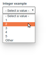
Allows the user to enter or select an integer.
Link
Allows the user to enter a URL and description.
List (float)
Allows the user to select from a list of numbers. Stored in float format.
List (integer)
Allows the user to select from a list of numbers. Stored in integer format.
List (text)
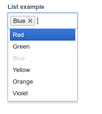
Allows the user to select from a list of text either as select list, radio, or checkboxes. Stored as text.
Location
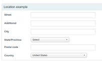
Allows the user to enter a location.
Long text
Allows the user to enter a paragraph or more of text.
Markup
Outputs text the learner can view before enrollment. Can be used for instructions, etc.
Phone number
Allows the user to enter a phone number.
Term
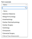
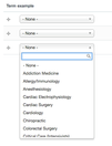
Allows the user to select from a list of taxonomy terms.
Text
Allows the user to enter in a line of text.
Non-supported fields
ACCME contributor: Do not use, for internal system use only.
ACCME income: Do not use, for internal system use only.
Contributor: Do not use, for internal system use only.
Course reminder: Do not use, for internal system use only.
Entity reference: Do not use, for internal system use only.
Field collection: Do not use, for internal system use only.
Fivestar: Do not use, for internal system use only.
Image: Do not use, for internal system use only.
Income widget: Do not use, for internal system use only.
Long text and summary: Do not use, for internal system use only.
Node reference: Do not use, for internal system use only.
Role: Do not use, for internal system use only.


